
What Makes For a Great Flag?
February 17, 2022
Bright colors and neat designs, tied together with meaningful symbolism — flags are great. But what makes for a great flag?
Recognizability. A flag is, above all else, a symbol, and that makes this factor the number one priority. The recognizability of a nation’s flag is a collective of the other qualifiers that follow. However, it is also a product of the significance of a country in mainstream culture. Since larger countries are naturally advantaged in this category, we need to expand our qualifications.
Symbolism. Sure, all flags are symbols in their own right, but the contents of a flag should hold some amount of meaning as well. The Turkish flag’s indication of Turkey’s Islamic origins with a crescent and star is an example of excellent symbolism, without being too complicated. Symbolism doesn’t seem like such an important factor until you encounter a flag without sufficient meaning. Maybe it’s just because I’ve grown up seeing the Star-Spangled Banner, but I really feel like the number of stars on the European Union’s flag should signify something. Even a flag with fantastic symbolism, however, can still be significantly lacking in other areas. The flag of Austria is based on the legend of a Duke who flew his bloodstained shirt after losing his standard in battle — that’s really cool, Austria, but your flag is still boring.

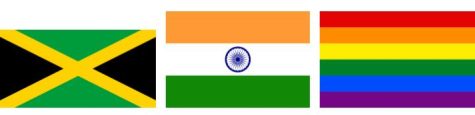
Uniqueness. This goes a long way towards making a flag recognizable, and it comes in multiple forms. Color diversity is a big one. That’s not to say that countries should stop putting red on their flags — red is by far the best color to feature on a flag— but maybe stop pairing it with blue and white. At this point, all they’re doing is making the Jamaicas and Indias of the world stand out more. A lack of color diversity in most flags is also what makes the pride flag such a fantastic design. With our minds used to seeing the same three colors in every flag, the pride flag grabs our attention with its distinctive rainbow stripes.
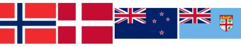
Beyond color, unique designs seem like an obvious way to distinguish one’s flag from their neighbors. However, a number of countries seem to have not picked up on this. Norway, Sweden, Finland, and Denmark all decided to fly the Nordic cross, while Australia, New Zealand, Anguilla, Fiji, Tuvalu, the Cayman, Cook, and Falkland Islands, and even Hawaii all decided to plagiarize the United Kingdom’s Union Jack on their flags. I feel like once you break free of your colonizers, you should let their flag go too, but what do I know?
A less talked about factor of a flag’s uniqueness is its aspect ratio, which comes in far more different forms than one would originally realize. While the common 1:2 aspect ratio can lead to some fantastic symmetries when utilized well, 2:3 is popular among three-stripe patterns. Past 3:5 however, it begins to get more convoluted as we move into the territory of America and Liberia’s 10:19 (It seems like it would make more sense to just stick to 1:2, I mean seriously, this change is not significant enough for anyone to notice) or El Salvador’s — oh no — 189:335 aspect ratio. The sides of the flag of Togo are in the golden ratio, an irrational number approximately equal to 1.618034. And then there’s Nepal. A part of me wants to hate Nepal’s flag for trying too hard to be quirky and different, (“I’m not like the other flags,”) but it certainly is unique.
Some countries attempt to offset the conformity of a boring three-stripe design by featuring a seal or emblem on their flag, (Ex. El Salvador, Guatemala, or Afghanistan,) but this leads to another problem…

Bottom row: Togo, Nepal, Guatemala, Afghanistan
Simplicity and Reproducibility. A good flag should be able to be roughly reproduced by a second-grader while they learn about the nations of the world. In other words, while I don’t think emblems or text is inherently wrong to feature on flags, it’s easy to go too far with an overly complex design. For example, the flag of Maryland, which is seemingly one giant emblem, hurts to look at for longer than three seconds.
On the other side of the same coin, a boring design is, well, boring. I’ve already touched on the two and three stripe patterns, but it’s worth repeating. At a certain point, it doesn’t matter that Ireland’s flag features the uncommon color pairing of green and orange, or that it represents the unification of Ireland’s Catholic tradition with its Protestant community. It’s just three stripes. I don’t know, at least take a page out of Mozambique’s book and put an AK-47 on there or something.

The Cool Factor. With the exception of Bhutan and Wales, featuring literal dragons, (which seems almost unfair,) the Cool Factor is hard to quantify — but you know it when you see it. Perhaps the flag has an especially pleasing symmetry, like the Union Jack, or asymmetry, like Seychelles. Maybe part of it looks like a Christmas sweater, like Belarus. Or most likely, perhaps it features a cool emblem, like the Isle of Man. (Keep in mind, an emblem can meet the Cool Factor while still being too complicated to fulfill the other requirements of a good flag.) In any case, while a flag can be “good” due to its recognizability, symbolism, and uniqueness, it must also check off the Cool Factor before it can truly be great.
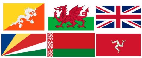
Bottom row: Flags of Seychelles, Belarus, and the Isle of Man
So then, with the parameters set, what is the best flag? I find that the best flags are those that remain relatively simple in both colors and design, while still meeting the Cool Factor. It seems that on their way to fulfilling these requirements, they tend to check the uniqueness and symbolism boxes as well. After careful deliberation, I’m left with three options.
Canada. It feels somewhat hypocritical to name Canada’s flag a favorite after discussing my disdain for the commonality of the three-stripe pattern and lack of color diversity in national flags, but it truly is masterful in its simplicity. The red maple leaf is a meaningful symbol, bold on its white background, while still remaining a simple emblem. The flag is instantly recognizable among 194 other countries.
Albania. This flag is a favorite for remarkably similar reasons to Canada. With a blank red background, all attention focuses on the flag’s fantastic emblem. The details of the double-headed eagle teeter on being too complicated, but since the emblem, frankly, surpasses the cool factor, this concern is more than offset.
Brazil. Everything about this flag is unique without being overly complex. The color combination is entirely unique, as well as the inlaid diamond pattern. The symbolism has depth — the globe at the centerpiece maps the night sky exactly as it could be seen from Rio de Janeiro on the day the Brazilian monarchy was brought down. The text is small enough to not be a “red flag,” so to speak. This flag is perhaps one of the most recognizable in the world.

At this point, it feels like comparing apples and oranges. The true “best flag” really comes down to which factors you deem more important than others. Besides, I should stop deliberating before I end up defaulting to Bhutan or Wales.


Tanzila Jamal • Apr 10, 2022 at 8:28 pm
Adam, I really liked this article! I feel like you touched on every aspect that makes a flag great!
Tanzila Jamal • Apr 10, 2022 at 8:26 pm
Adam, I really liked this article! I feel like you touched on every aspect of what makes a great flag!